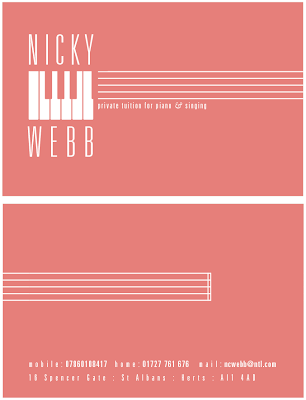
These simple designs are clear, reversed out on black gives it a very serious edge, not what I was going for, the layout works, but it needs some colour.
This is a


This is a very a jazzy approach, as in jazz piano. The tight condensed Univers typeface is synonymous with this genre, it looks cool on the front of the business card, but does not suit the type of teaching she does.
Univers Tight Condensed does not really work well for clarity, so having the contact details in this typeface is not preferable.


No comments:
Post a Comment