I decided to combine this with my interest in brand identity to create an identity package for the ‘Web Design Ledger’ that would allow me to write my ‘perfect’ brief. Of course I now realise that it is impossible to write a perfect brief for myself, as what I want to achieve is always evolving. After this brief I have realised that brand identity is something I am interested in, however I am not committing myself to specialise in it as I am also very interested in editorial and layout; which I will be practicing and experimenting with over summer in collaboration with a friend of mine, who is a very talented photographer.
As far as learning skills goes, it is quite hard to judge. I will only know how much my branding experience has progressed when it comes to designing another identity package. I know now where to start, how much development is needed and how long I need to develop an identity. I will certainly write myself a few briefs or find some live work over summer to address my branding practice. However, I am sure that my illustrator skills have improved. This is first time ever that I have relied on illustrator to come up with almost all of my design work. I also feel as though I have applied my recently learned typography and layout skills well to this brief. The exhibition guide was quite demanding, as the amount of copy to fit into the chosen format, required some careful tweaking. I researched into layout theory and especially the momentum that can be generated and sustained within a body of text. I thought this was especially relevant for an exhibition guide, where there is a lot of information to read around one piece of work, multiple times.
My project was not research heavy, I really wanted to spend as much time designing as possible, as I was well aware that my portfolio was weak or at least in my view unsatisfactory. I knew this may have some effect on the grade, but I though it was for the best, as my motivation was low and the reason for that was that I was not designing enough. However I looked at a lot of secondary work from a range of magazines, journals and books as well as the Internet of course. I found some editorial work by ‘North’ that really inspired me to be more creative with my own layouts. After this module I feel confident that I have some good work to add to my portfolio and will be much more confident when e-mailing it out to studios for placements and visits.
I looked quite a lot at stock, which I know from past briefs can be really interesting. I am not sure that stock is my passion, but I would say that next year, when my work becomes more editorial based I will be looking for the perfect stocks to print onto. I will endeavour to contact printers around Leeds and also my home city. I know that a few third years have managed to get a foot in the door with some paper manufacturers and I am determined to make that happen for me.
I was happy with the work I created for almost all of the range. Of everything the website is the weakest, the layout from the beginning was not working and I left it too late to spend much more time on it. It isn’t bad, but it could have more continuity when viewed within the range. The layout of the text should have had more of a connection with the layout of the exhibition guide. Also the colour coded headers for the range of sectors within the Design Ledger could have been applied, as they have been on the business cards.
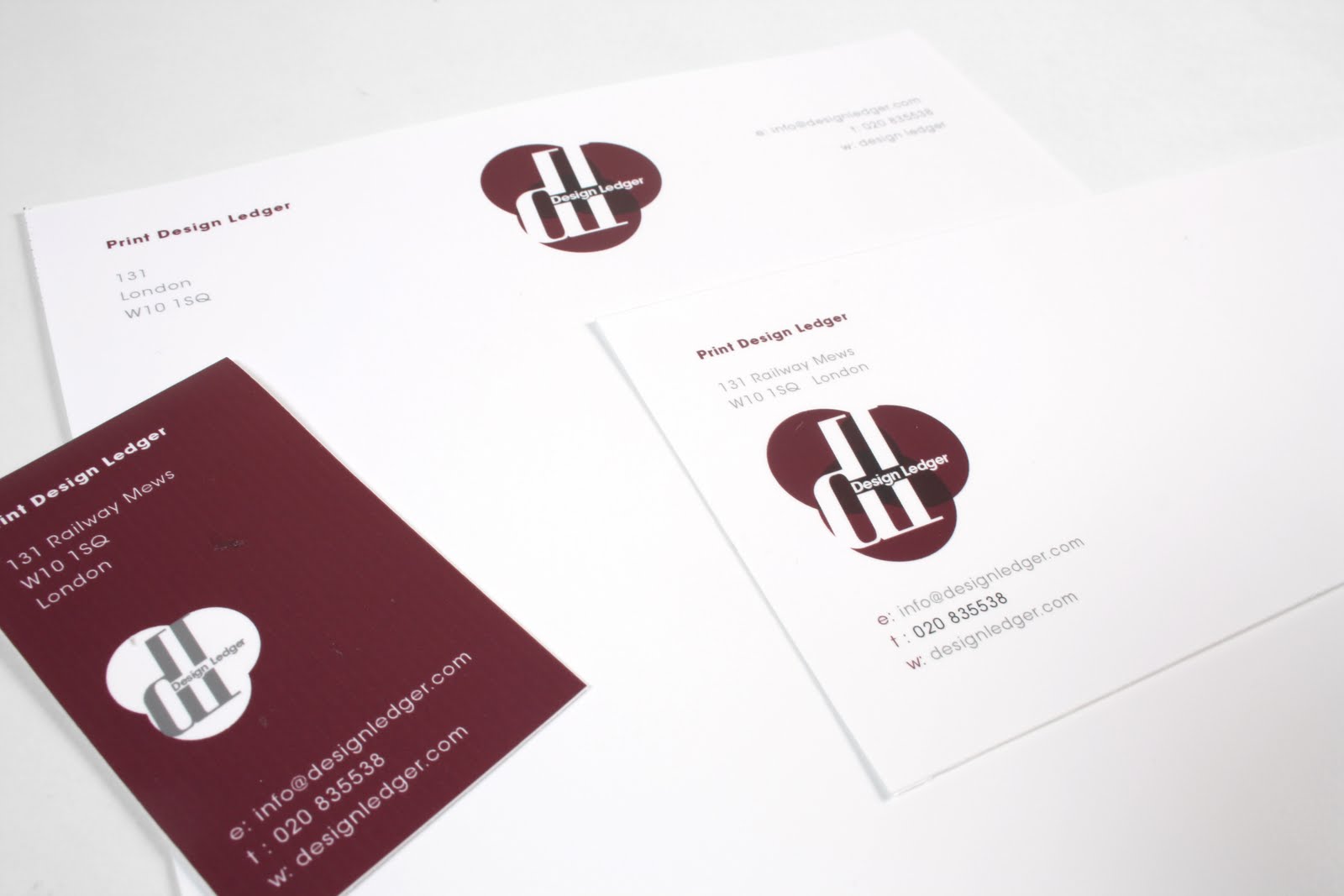
The final logo and identity package was ok. It is well designed and considered, but I cannot feel as though I did not exploit the full potential of the formats. I only printed duplex once, I realise now that I should have begun designing letterheads, business cards and compliment slips from week one. It was only after printing out multiple treatments of layouts and logos that I could clearly see what was working. If I were to do this brief again, which I am quite temped to do I would take more notice of the fact that I was designing for a design-based company. Their identity package needs to be as much a showcase of their work as their portfolio. I don’t think my final outcome captured this.
1.
Begin designing in the first few days, not leaving it until the second week.
2.
When designing logos, don’t spend time polishing an idea in biro or pencil, get them onto a mac and visualise them properly.
3.
Consider the potential range while designing the identity, that way you can mock up idea quickly and see what works immediately.Design personal work along side the brief(s).
4.
Develop my own practice away from the course to increase motivation and strength of portfolio.
5.
Bring more to crits.
Attendance: 5
Punctualituy: 4
Motiovation: 3 >> 5
Commitment: 4
Quantity of work: 4
Quality of work: 4
Contribution to group: 5