


This module was extremely challenging, firstly because negotiating my own briefs took a lot longer than I wanted. I got confused for at least the first week on how to even begin deciding what I wanted to do, despite the workshops. After the brief proposals during the second week I was even more confused, I had no idea what subjects I wanted to address. For some reason I could not see how I could generate or obtain the content to create what I wanted to do. Instead of fretting I simply sat down and started designing something, it worked and a week later my first substantial brief was well under way. Over the duration of this module I have learned the most important lesson of all, that anything can become a brief. A word, a place, a time or simply a concept. Therefore at present I feel fairly confident going away and thinking about what to do for my FMP, knowing that whatever I think of in the end can untimely be turned into an exciting brief.
Although the briefs I ended up taking on were not at all what I would have expected to be doing they all benefited me in their own way. I knew that I wanted to progress my ability with typography and layout, across a range of formats for print. I learned how to quickly mock up books and evaluate the content of the layout effectively in a short time. This was evident with the LCD brief, where I had to mock up a copy every few hours to make sure the readability was fine and that the decisions I made were working. The process has been hammered into my brain to the extent that forgetting it is most likely impossible. It will make creating publications much easier for the next half of the year.
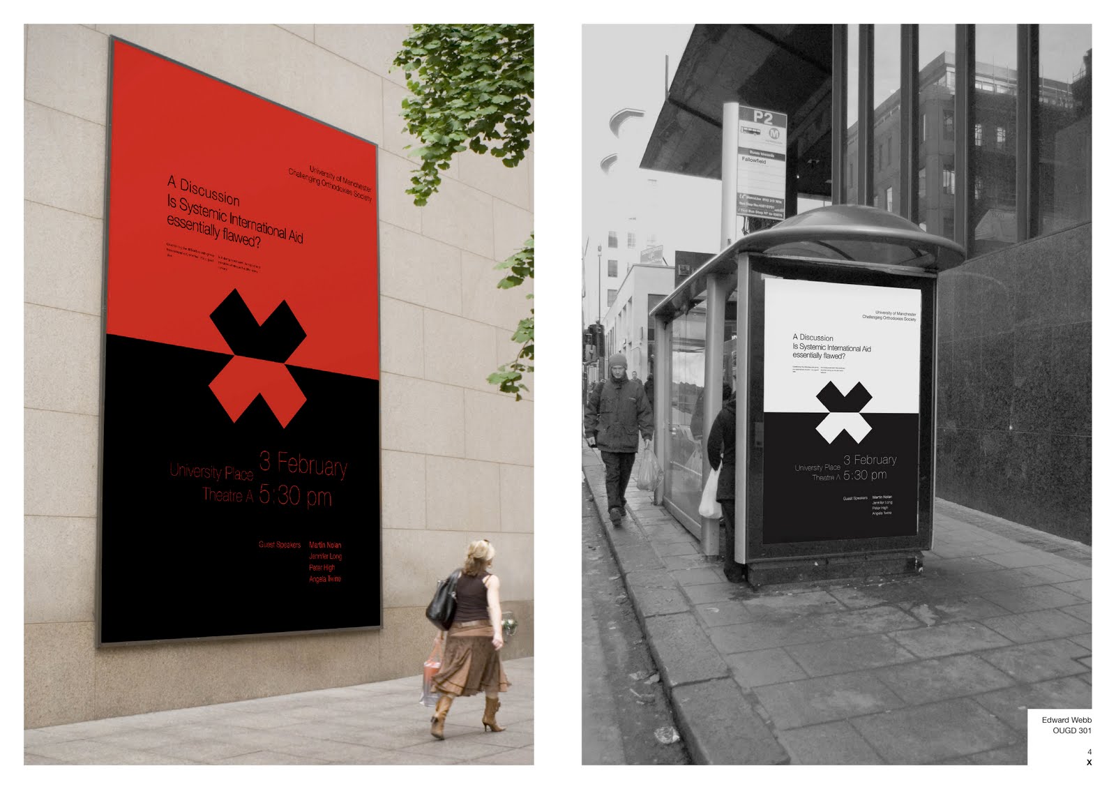
My knowledge of typefaces, grids, format and hierarchy has greatly improved. Up until now I had felt I was simply pushing type around on a page, searching for an aesthetic and functional resolution. However, exemplified by the ‘X’, LBW and LCD briefs, I am confident that my design has become concept driven, with appropriate layout choices applied to each brief. Although there is not necessarily a personal ‘style’ of work evolving, I do feel for the first time that I can say that I am a becoming or even am a specialist in this subject, and that taking on any brief concerning layout and type will not be over my head. Perhaps that is a bold statement, but I stand by it until proved wrong.
Saying that, my Leeds Bike Week publication was not as good as I had hoped. It worked as a piece of functional design, but as a practice in creative layout I do not feel I pushed the boundaries as much as I could have. I felt that I needed to take sure the content came first. This is probably because the information was such that it needed to be communicated clearly and in an understandable way for a wide target audience. If it had been aimed at a creative audience I would have felt I could have made much bolder decisions. For this reason I spent a long time on the LCD brief creating experimental layouts that could never function in that context. Playing with the grid and the golden section, canceling out the layout solution that were not working but did look good has given me a sounder knowledge of functional layout.
The LCD brief also gave me the chance to re-address book binding, something I try to avoid as my hands on skills are poor. As usual all my mock up binds worked better than the final, so I intend to make it again and get it right. I think it will be a very strong piece of work in my portfolio. I am very happy about his because my main concern after 2nd year was that my portfolio was lacking in good design, certainly in comparison to the work I have now. For this reason I am very excited about the FMP.
I had written in my rationale that I wanted to be better at quick turn around identity design specifically, s over the summer while on experience I was given 3 hours to create four logo proposals. I managed to do it, but the designs were not up to a standard I had hoped I would be at. I felt it was important to be strict with myself when designing these identities and spend no more than 2 days on each. The BUC (Bournemouth University Climbing) logo design was very tricky. As a climber I was aware of current climbing logos, and how they all conform to a technical / serious tone. My client, the president of the climbing club wanted a fresh look, happy, approachable and nature based. My resolved design was approved and will be going into print on hoodies, T-shirts and a small promotion range. This gave me confidence that even though getting stuck on an identity design is stressful and can be a worrying time, a solution can always be found and after a few days of searching it will most likely be successful.
The module was challenging and stressful at times, but it has armed me with the confidence and the technical skills to take me through to my FMP with a confidence I would have paid for.


