These pages were a chance to have some experimental fun with the layout, without loosing sight of clarity and accessibility.
Concept 1 follows the same contents page as (2). I think the 3rd concept is more fun though and I think i will regret not using it.


The bold type on these pages looks really cool. Not great analysis I know but sometimes things just gotta look cool.

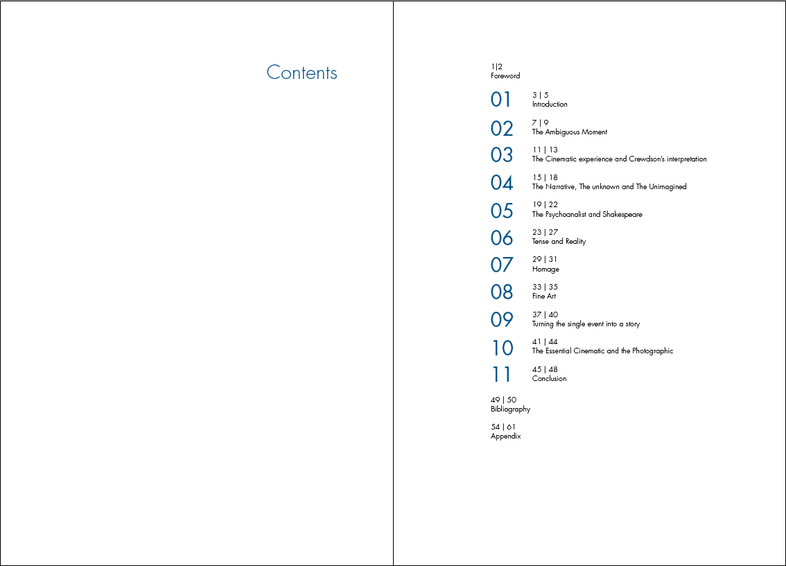
Concept 2 has a very accessible contents page. The numbering is a direct visual relation to the chapter numbering in the book. The gutter is large to add some shape to it.
The block colours are also related to the book, with its full bleed chapter pages.


I am very fond of this diagonal contents page. It links in with the diagonal lines used to tie the chapters together and does not look at all outrageous. I don't know why more contents pages aren't more fun.

The appendix is heavily image based. It is paramount that the photographs have some priority here as they are referenced to and will need to be refereed to by the reader. Also because of the nature of GRegory Crewdson's photography, they deserve to be seen large format if not full bleed.


No comments:
Post a Comment