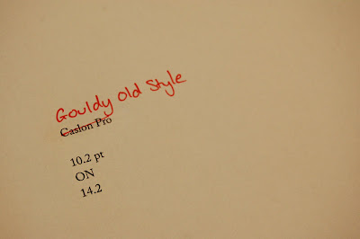
I felt as though Caslon Pro was a little too machine like, too perfect and ordered. It would look crisp on the page, but it lacked in style, no flourishes. As a type guy I just couldn't hack it.
Gouldy Old Style is a typeface I have never used, I always looked at it as if it were an old fashioned, out dated typeface. However I noticed a few things about it that I really liked. The strange contrast, the interesting angled hyphens and its slanted vertex.


No comments:
Post a Comment