It will allow for us both to get of computers for a while and start using traditional printing methods, something we both enjoy. Vickie has a lot more experience with print methods than myself, so her side of the brief will be the technical printing side and design direction. My part will be to draw upon and develop some typography skills, with a particular focus of hierarchy.
This has the most potential for further development. I want to do more development right now! But I have dissertation to write. I will get some feedback tomorrow, but it will not be as good as I want because I am aware that these are not nearly working as well as they might. After all this is only the first 2 hours I have spent hours of the brief.
Vickie has also been doing some letterpress, playing with the title of the book. Take a look at her prints, they are CRISP!


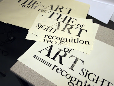
This is ambiguous, it doesn't read how it should, but I think it just a matter of scaling down the 'of' and perhaps shifting it to the right a little. I was limited with time and pt sizes of wood blocks, so with some more time I could make it work.

I have been looking at quite a lot of David Carson work, and his approach to design speaks to me in a way that is not daunting or at all pretentious. His thoughts on rules are quite amusing to me and I feel as though I can relate to how he feels, not that I am comparing myself to him of course. Designers will usually tell you that to break rules you have to understand them, Carson says, he never learned the rules, so he never feels that theoretical or tradition justification is needed, he just aims for his work to be fun for the audience to read. The idea that typography should never be noticed is a false idol in his opinion.
I too think there are too many rules and far too much structure to design. Less and less we see revolutionary design from individuals, and I believe that is somewhat to do with rules and teachings that must be taken as design law.


No comments:
Post a Comment